How we did it | Brazil's racial dot map
One point per person
Created by pata
27 de Outubro, 2015
Click here to go to the map
What is this?
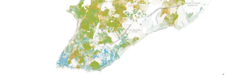
What you are seeing is an interactive map of racial distribution in Brazil. Through it you can see the geographic distribution, population density, and racial diversity of the Brazilian people. Each dot on the map represents one person¹. The location and color of the dots are based on the IBGE (Brazilian Institute of Geography and Statistics) Census 2010, available online; each color on the map represents one of race options possible in that census.
The census provides, among other things, geo-referenced data (divided into census sectors, the smallest geographic unit of the research) on the self-declared race for each Brazilian citizen.
In a nutshell, the map was generated by randomly positioning within each census sector the dots / people who belong there. As the census sectors are, in general, relatively small geographical units, this method provides a fairly accurate result of the racial distribution in space.
The motivation for this project came from the lack of geographical population views, which are often made based on artificial geographic divisions such as cities or states. We wanted an effective and easy way to view the data from the census.
The map was created by us from pata; the inspiration and the basis of the code used to generate the map came from Dustin Cable, a former researcher at the Cooper Center for Public Service at the University of Virginia, and author of a racial map of the United States . He, in turn, was inspired by Brandon Martin-Anderson from the MIT Media Lab, and Eric Fischer, mapmaker / programmer.
¹ Or almost: for security reasons, data from census sectors with less than five households are not disclosed.
The dots
Each of the more than 190 million dots on the map is a Brazilian citizen. Due to the map scale, each point is smaller than a pixel in many of the zoom levels available. This means that what you see are actually clusters of dots (and hence, people), unless you're viewing in a high enough zoom to focus on cities or neighborhoods.
Each different color represents one of the races that citizens could choose in the census. Green represents brown people, red represents black people, blue represents white people, brown represents indigenous people, and yellow represents yellow people (it is noteworthy to say that this is the terminology adopted by IBGE).
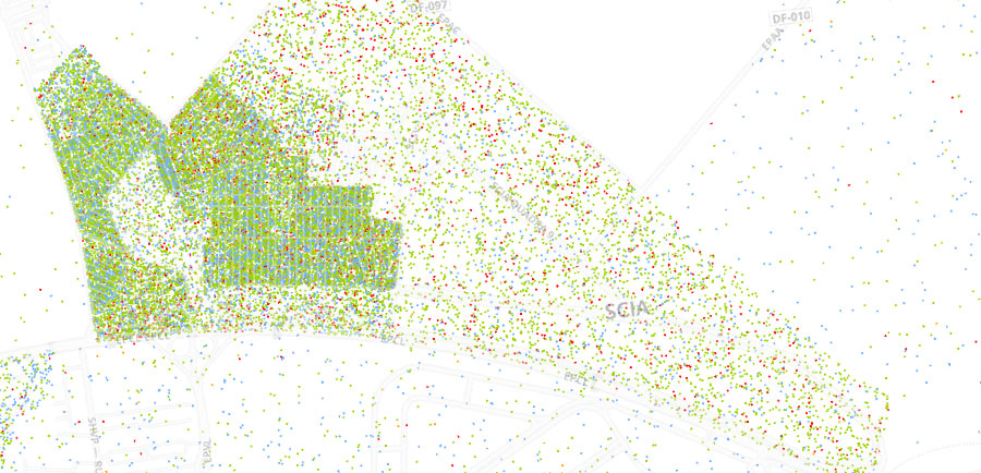 Example from an area from Distrito Federal at maximum zoom level
But I'm seeing other colors on the map
Well, as we said before, since in smaller zooms (map seen from afar) the dots are too small to be seen individually, in places with large (geographical) miscegenation of races, there is a blend of the colors of the dots: for example, if a region contains 40% black population (red dots) and 60% white population (blue dots), the resulting color is actually a shade of purple.
As the concentration of each race determines the pixel color, redder shades of purple correspond to an area with more blacks than whites. Applying this analysis to the other races and dots on the map, we can observe the concentration and racial integration of the whole country.
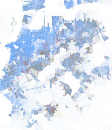
It is also important to say that a place that seems to have a high racial integration in distant zooms may present a completely different reality when analyzed in closer zooms. A city with a clear ethnic division between their neighborhoods will demonstrate it in closer zooms, but it may appear to have a greater integration in smaller zooms due to the scale.
Below is an example: Porto Alegre from far away shows shades of purple. If examined closer, we see that red and blue dots are mixed:
Demographic density
You can also view only the demographic density on this map by turning off the division into colors. This is especially useful when analyzing areas with low population density; in the map with colors, the white from the background mixes with the few points and makes their visibility difficult (giving the impression that no one inhabits those places). This does not happen on the map in black and white where the black dots of each citizen are clearly visible (respecting, of course, the zoom levels).
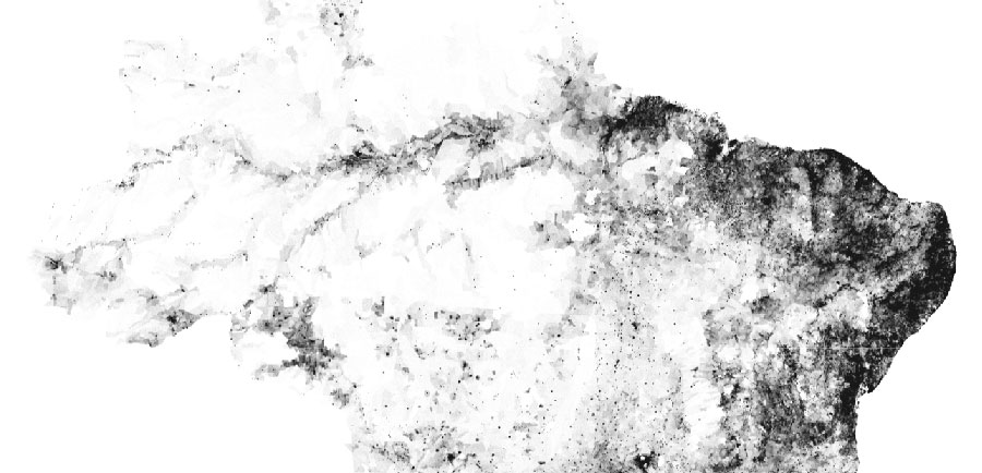 We have more than 50 shades of grey
And what about these points right in the middle of parks and lakes?
Blame the IBGE. Or not, because it would probably be irresponsible to disclose the exact address of every citizen. This is because the census sectors as outlined by the IBGE don't always take into account the exact location of parks, plazas, etc., nor roads or streets.
As stated, the only information that we have are the limits of the census sector and the number of people (spread over races) that inhabit this unit (without more specific data about where each dot lies), and therefore the developed algorithm generates a random location for each dot within the area of the corresponding sector. Therefore, this place could be a park or a cemetery if the unit contains one of these, but that does not mean that the person lives in the park or in the cemetery, got it? (To our knowledge, the IBGE has not included ghosts in its census).
And some people do live in lakes and parks.
Methodology
First, we associate the race data provided by the IBGE in the csv format with the map of each state and the Federal District (also provided by the IBGE) using the QGIS tool. The result is a shapefile for each of the Brazilian states and the Federal District.
We then utilize Python (and the osgeo, shapely, and sqlite3 libraries) to read each shapefile and generate geographic coordinates for each person / dot. The coordinates are determined randomly for each point, but taking into account the limits of the census sector that containins that person / dot. The output of this stage is a .db database with approximately 12GB. Each line in this file represents a dot with coordinates (x, y), a code to symbolize its race, and a quadkey used by the Google Maps system.
This .db file was then converted to the csv format and sorted by quadkey. The table must be sorted so that, in the next step, it is possible to correctly generate the tiles for the map. The generation of the tiles is performed in Processing v3, which basically reads the coordinates and race code of each dot and generates them in the corresponding place, with the corresponding color. This process is repeated for each zoom level, generating, obviously, larger maps for the bigger (closer) zooms.
Finally, we use the Google Maps API to display our map. Tiles without population are not generated, so a workaround is used so that the API does not generate a 404 error when dealing with these places.
That's awesome, bro! I want to do that
All the programs we used and more detailed technical instructions are on GitHub. They are the result of an adaptation of the code used by Dustin Cable, which in turn adapted the code created by Brandon Martin-Anderson and Peter Richardson.
You are free to use our code to create interactive maps, dot visualizations, or any other type of interaction that comes to mind. You can also use the information for scholar work, research and any other uses.
Hmm cool, but I'm not a programmer, it seems difficult, can you do it for me?
Yup! pata is an agency specialized in data visualization and intel. Want to view data from an interactive and innovative way, or think of strategic solutions using data for your organization? Send an email to quero@patadata.org